Hallow Thorn
Bad Ass Wicca
 Oh and You're Welcome
[Mo0:0]
Oh and You're Welcome
[Mo0:0]
Posts: 2,306
|
Post by Hallow Thorn on Mar 1, 2009 5:45:40 GMT -5
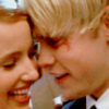
Wow sooo much better:) Buffy season 1, Aftermath, season 8, 2 Cordy pics... 10/10
|
|
|
|
Post by CowboyGuy on Mar 3, 2009 17:30:22 GMT -5
I like the forum, simple to use, but when you have finished reading the whole one of the boards, there are some with Red buffy shields that turn gray once read which is good, but the images don't change so i keep clicking in and realising i have nothing new to read.  True, the shields are the default icons. And they work. But for some reason when I upload the new customized ones, only the "on" icons show up, even when the gray "off" ones should. In short, would you all prefer that all boards use the shield icons so that the on/off feature will work? Or do you ignore that, and like each board having it's own icon?
Note: On/Off means - red shield shows there are new posts in that board that you have no seen. Gray indicates that you have been in that board and there are no new posts |
|
|
|
Post by Wyndam on Mar 3, 2009 17:55:30 GMT -5
I like the forum, simple to use, but when you have finished reading the whole one of the boards, there are some with Red buffy shields that turn gray once read which is good, but the images don't change so i keep clicking in and realising i have nothing new to read. True, the shields are the default icons. And they work. But for some reason when I upload the new customized ones, only the "on" icons show up, even when the gray "off" ones should. In short, would you all prefer that all boards use the shield icons so that the on/off feature will work? Or do you ignore that, and like each board having it's own icon?
Note: On/Off means - red shield shows there are new posts in that board that you have no seen. Gray indicates that you have been in that board and there are no new postsIs there a way to possibly have 2 board layouts? One with the boards having just the red/gray icons and another with the individual picture icons? Then I guess people could choose which one they liked in their profile? The layouts would be exactly the same, only one would just have the red/gray emblems instead of the individual emblems. Honestly, when I first got here, I really liked seeing the red icons so that I knew which board had new posts. But I can't do that anymore, as it is hard to tell which board has new posts, so I just keep the '35 new posts' page up and refresh that to find new posts. I have gotten used to this system of staying updated (and I think the individual icons give the board a lot of personality), but I definitely wouldn't mind seeing the gray/red icons again. I think it all just depends on what people like. I am fine with either system though. I think you have said in the past that it was possible to make a few layouts that members could then select the one they liked in their profile, so I thought that might be an option.  |
|
|
|
Post by CowboyGuy on Mar 3, 2009 20:23:31 GMT -5
Yes, we can have themes. But HTML for the layouts will remain throughout themes, so things like the icons will stay.
So it's a matter of either having them, or deleting them and never having them again. I agree that it gives the forum personality and gives something to look at other than a long line of a bunch of shields.
|
|
|
|
Post by Wyndam on Mar 3, 2009 20:26:44 GMT -5
Ah okay, no worries then. The individual pictures look great, so I'd hate to lose them altogether.
|
|
|
|
Post by Emmie on Mar 3, 2009 21:34:45 GMT -5
Yeah I'd hate to lose the individual pictures too. I love them!
|
|
|
|
Post by Angelsgirl on Mar 4, 2009 3:36:28 GMT -5
I say keep the pictures too. They look much better. It did take some getting used to when you didn't have the shields, but like Wyn said, you can just use the 35 Most Recent Posts, which I tend to refresh constantly too.
|
|
Joe
Wise-cracking Sidekick
Obsessive Paranoid Boob
"Gypsies are filthy people! We shall speak of zem no more!" *spits* -Ilona Costa Bianchi[Mo0:0]
Posts: 2,786
|
Post by Joe on May 2, 2009 7:23:06 GMT -5
So we're not getting a "new Buffy issue" layout every month anymore?
|
|
|
|
Post by iamthewalrus on May 2, 2009 9:05:40 GMT -5
yeah, i liked that idea too
but i think this months issue might be a bit tricky to crop
anyway, i like the new layout
tho i'm not a fan of the green font
|
|
|
|
Post by CowboyGuy on May 2, 2009 15:02:24 GMT -5
So we're not getting a "new Buffy issue" layout every month anymore? Yes, but remember that the Time of Your Life TPB is out this month so I can cheat! LOL! The Dawn/Thricewise cover didn't look right. Look for Oz and Co. to be on the layout next month. |
|
|
|
Post by tms on May 2, 2009 15:07:02 GMT -5
it's still stretchy! D:
|
|
|
|
Post by CowboyGuy on May 2, 2009 21:56:34 GMT -5
What is your screen resolution? It fits perfectly on my screen with lots of blank space on the side. |
|
|
|
Post by tms on May 2, 2009 22:40:05 GMT -5
never mind, phil! I changed my screen resolution from 1024 x 768 to 1152 x 864! |
|
Just Willow
Wise-cracking Sidekick
Look to the Western Sky
[Mo0:22]
Posts: 2,575
|
Post by Just Willow on May 3, 2009 0:18:59 GMT -5
So we're not getting a "new Buffy issue" layout every month anymore? Yes, but remember that the Time of Your Life TPB is out this month so I can cheat! LOL! The Dawn/Thricewise cover didn't look right. Look for Oz and Co. to be on the layout next month. on the subject of board icons: i vote keep the individual pics. the shields are hand, and i love them, but i think the pics look better overall. i love this layout! and i love the Character App for this month. Tara is awesomeness! oh my gravy...that thing on the front cover of Living Doll is the thricewise!? wow, i so didn't make that connection. craaaazy. now i'm twice as pumped for it! |
|
|
|
Post by Midnight Butterfly on May 3, 2009 16:21:41 GMT -5
I liked the last layout better, but I love this one too  I was just wondering seing as I only joined a few months ago, Did the board previously use Buffy images from the TV show as the layout instead of Season eight? |
|
|
|
Post by Rebecca on May 3, 2009 19:04:41 GMT -5
Forum Layout Feedback:
When rendering the sub-boards (one layer below the first one) the first column is really wide. It's been happening for a while now, and I'm wondering if anyone else is seeing this.
|
|
untouchable
Respected Watcher
My December
[Mo0:28]
Posts: 533
|
Post by untouchable on Jun 3, 2009 21:41:14 GMT -5
I'm not sure if this is the right place or not but I was wondering if we could create a separate board (or sub-board) for birthday greetings? There have been quite a few new threads in the past week for each persons birthday (even though there is a thread dedicated to birthday greetings) and I find it a bit of a nuisance to weed through them all when I'm checking out the Bronze board. I don't have a problem with them, I just wish there was a separate section for them.
|
|
|
|
Post by Midnight Butterfly on Jun 8, 2009 12:10:03 GMT -5
I think it would be nice if the navigation bar (used to move page up and down) at the side of the page matched the layout.
You can use html codes to change its colour.
|
|
|
|
Post by CowboyGuy on Jul 1, 2009 6:07:18 GMT -5
Layout for July is up! This one was a little challenging since I wanted to include as many characters as I could. As usual...look forward to the next layout in August!
|
|
theend
Potential Slayer
Dollhouse DollFreakinHouse[Mo0:0]
Posts: 137
|
Post by theend on Jul 1, 2009 8:11:57 GMT -5
Layout for July is up! This one was a little challenging since I wanted to include as many characters as I could. As usual...look forward to the next layout in August! I love it!! So pretty! But what happened to the awesome forum icons?? They are all just Bs now  |
|