|
|
Post by Rebecca on Jun 5, 2009 20:19:53 GMT -5
Aww crap. Lol. *puts on her serious face*  To the Duel! |
|
|
|
Post by Rebecca on Jun 7, 2009 19:30:02 GMT -5
Updated with Graphics Challenge banner!
|
|
|
|
Post by Rebecca on Jun 17, 2009 15:28:06 GMT -5
Updated with an As You Were set for Shivi: 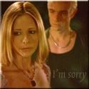 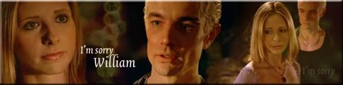 |
|
|
|
Post by Rebecca on Jun 22, 2009 19:13:45 GMT -5
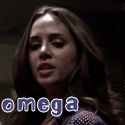
Updated with an alpha set I've been thinking of for a while now. Not sure if I made it too complicated... I used brushes as textures, lines, motion blur, lots of re-coloring, seven screencaps... I think it turned out too congested. Oh well  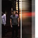 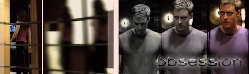 |
|
xaphania
Wise-cracking Techno Genius
 [Mo0:0]
Posts: 705
|
Post by xaphania on Jun 22, 2009 19:24:02 GMT -5
I like it! Great concept. I agree with EWR though, the pink line in the middle splits the banner a little.
|
|
|
|
Post by Rebecca on Jun 22, 2009 19:25:10 GMT -5
Haha, is it pink? Looks white to me. May have to fix that Thanks for the kind words - *karma* Xaphania - I take it the splitting is a bad thing? That's kind of what I was going for... |
|
|
|
Post by Rebecca on Jun 22, 2009 19:31:44 GMT -5
lol the lines were to show the disparity of alpha with his surroundings, whooshing by, unnoticing. does this help the banner flow a little better? taking out the middle lines? 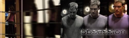 |
|
xaphania
Wise-cracking Techno Genius
[Mo0:0]
Posts: 705
|
Post by xaphania on Jun 22, 2009 19:34:06 GMT -5
I think that one flows better, you can still see the grungey brush to show the splitting of Alpha, it was just the pink line was very stark in the first banner, making me think it was two separate pictures. I really like how he fades from grey to purple, with a slightly different facial expression in each pic.
|
|
|
|
Post by Rebecca on Jun 22, 2009 19:38:15 GMT -5
Thanks! It was very dramatic on first viewing, I'm glad the 3-part facial expression came across! I think I went overboard on the Echo-in-motion part. I should just direct video I always seem to try to recreate the exact scene in 2-D... never works lol. |
|
|
|
Post by Rebecca on Jun 22, 2009 23:45:52 GMT -5
Updated with Bannerama 13 - Hilarity Ensues Submission and Winner!!! (Seriously didn't think I would win! There were so many good submissions!) 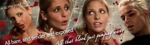 |
|
|
|
Post by Rebecca on Jun 23, 2009 11:24:21 GMT -5
It's actually "look" lol
|
|
|
|
Post by Rebecca on Jun 23, 2009 13:46:19 GMT -5
Re-did and added avatar:)   |
|
|
|
Post by Rebecca on Jun 24, 2009 12:43:20 GMT -5
Updated with Duel Banner  |
|
Secret Scoobie
Wise-cracking Sidekick
Puts words in word places
Shiny![Mo0:32]
Posts: 2,702
|
Post by Secret Scoobie on Jun 29, 2009 11:26:47 GMT -5
Omfg I am in love with your "Poor Neck" set  I don't know white avatar I like best... they are both great captions... hmmm, I maybe like the "Make Her Stop" text little more because I love that line.. but I love the whole thing! Duel banner is awesome too, you're soooo good at all of them. How did you get your images so crisp and well-coloured in Poor Neck? It just screams high quality! Mine never look that hot! What tools do you use most? I'm spewing cos I can't get downloaded brushes to work in my PS... it's a fake version so it doesn't have a brushes folder in the prog file... dammit! |
|
|
|
Post by Rebecca on Jun 29, 2009 12:41:46 GMT -5
Aww shucks, Jess, you're so sweet! Erm, honestly, I don't remember how I got the pictures to look so crisp! I spent SOOO long on it though. I think I started messing around with the "Adjustment Layers" hue/saturation, levels, and brightness/contrast, trying to make things pop. It was probably a brightness/contrast adjustment layer that did it. EDIT: updated with request set (or two) for drusillacakes     |
|
|
|
Post by Rebecca on Jun 29, 2009 18:27:56 GMT -5
Thanks for the feedback!
I wanted something to frame their gaze a little more, without it, it looks almost stretched, or leaking vertically. The box keeps the eyes in the center, horizontally, which is where the eye gaze should be.
I'd rather have put on a regular frame, but I haven't figured out how to do that in photoshop.
|
|
|
|
Post by Rebecca on Jun 29, 2009 19:27:41 GMT -5
I tried just selecting the area and brushing it the correct color. That seems to work well enough. Tried a semi-transparent recessed frame, suits it well I think.  |
|
|
|
Post by Skytteflickan88 on Jun 29, 2009 19:31:10 GMT -5
Really love the last set.
|
|
|
|
Post by Rebecca on Jun 29, 2009 19:45:16 GMT -5
thanks! :beam:
|
|
Alexiness
Novice Witch
There is no me... I'm just a container.[Mo0:0]
Posts: 268
|
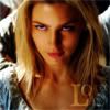
Post by Alexiness on Jul 7, 2009 10:02:11 GMT -5
Wow, your banners are so good!  |
|