patxshand
Ensouled Vampire
 Writer/director/Amy Acker's husband.[Mo0:0]
Posts: 1,918
|
Post by patxshand on Mar 22, 2009 21:59:15 GMT -5
Can I ask why? Personally, I find Runge's work in these issues to be not only the worst art of any Buffyverse comic, but some of the worst comic book art I've ever seen in my life. I'd really like to know what people see in it, because I certainly don't.  Woah, really? I thought his work in #11 was, until the last two pages, brilliant. His #9 or #10 are hit or miss, but more in the ballpark of decent than bad. |
|
|
|
Post by hitnrun017 on Mar 22, 2009 22:15:13 GMT -5
I think the problem with Runge's art was the dull-coloring. It drowned everything out, the same thing happened with Urru in Spike.
|
|
|
|
Post by Wyndam on Mar 22, 2009 22:37:43 GMT -5
Can I ask why? Personally, I find Runge's work in these issues to be not only the worst art of any Buffyverse comic, but some of the worst comic book art I've ever seen in my life. I'd really like to know what people see in it, because I certainly don't. Woah, really? I thought his work in #11 was, until the last two pages, brilliant. His #9 or #10 are hit or miss, but more in the ballpark of decent than bad. I agree. I had more issue with Lyon's coloring in those issues than Runge's art. His pencils were decent enough in #9-10, and it was all pretty good in #11. Lyon's coloring improved in Spike: AtF, but it never reached the level that Fabio's did. |
|
Hallow Thorn
Bad Ass Wicca
Oh and You're Welcome
[Mo0:0]
Posts: 2,306
|
Post by Hallow Thorn on Mar 23, 2009 0:32:02 GMT -5
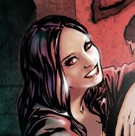
Who's work was it in #12-13 ? That was some of the best art I have ever seen... Angel,Cordy,Wes ect...
|
|
|
|
Post by Wyndam on Mar 23, 2009 1:04:18 GMT -5
Who's work was it in #12-13 ? That was some of the best art I have ever seen... Angel,Cordy,Wes ect... That would be Stephen Mooney. He also did the art for #14, Angel Interaction Contest covers and Connor and Kate's First Night stories. He's also doing the art/covers of the upcoming Not Fade Away comic adaptation launching next month.  |
|
Paul
Ensouled Vampire
[Mo0:34]
Posts: 1,173
|
Post by Paul on Mar 23, 2009 1:25:29 GMT -5
I have to get ready and leave for work, but I'm going to explain the problems I have with Runge's art when I get back.
|
|
Hallow Thorn
Bad Ass Wicca
Oh and You're Welcome
[Mo0:0]
Posts: 2,306
|
Post by Hallow Thorn on Mar 23, 2009 1:29:30 GMT -5
Thanks Wyndam... Yeah Stephen Mooney is the best ever... The only real BAD art I found in this was the page before #12 with Spike, Gwen and Connor...
|
|
|
|
Post by Brian Lynch on Mar 23, 2009 1:46:49 GMT -5
Mooney is just amazing. So lucky to have worked with him.
|
|
|
|
patxshand
Ensouled Vampire
Writer/director/Amy Acker's husband.[Mo0:0]
Posts: 1,918
|
Post by patxshand on Mar 23, 2009 7:23:55 GMT -5
I'm excited to see Mooney's art in "Not Fade Away," but I kinda just want him on the Angel series proper. Like if that series were illustrated by Mooney and Messina, trading off every arc or so, with covers by Garner and Runge... and Franco stayed on Spike, doing covers (with one from either Messina or Mooney as well) then all would be perfect.
Then, of course, the world would explode. Just. too. awesome.
|
|
|
|
Post by hitnrun017 on Mar 23, 2009 7:33:41 GMT -5
I'm excited to see Mooney's art in "Not Fade Away," but I kinda just want him on the Angel series proper. Like if that series were illustrated by Mooney and Messina, trading off every arc or so, with covers by Garner and Runge... and Franco stayed on Spike, doing covers (with one from either Messina or Mooney as well) then all would be perfect. Then, of course, the world would explode. Just. too. awesome. I agree. Mooney is perfect for Angel, fit the tone of the show, and I really want to see him do the main series ASAP. I really liked Messina's art in the old IDW comics, so that'd be awesome too. Dave Ross is a great artist, I just don't think his style is right for Angel. |
|
Paul
Ensouled Vampire
[Mo0:34]
Posts: 1,173
|
Post by Paul on Mar 23, 2009 9:04:51 GMT -5
Ok, here's that comment I started writing this morning... I felt that Runge's work was horribly inconsistant, constantly jumping from cartoony to photorealistic, sometimes on the same page. Look at the page in #9 with the "Burge Is My Master Now" joke... you have the Loan Shark and the t-shirt demon looking very basic and cartoony, and then you have Lorne looking totally photorealistic. Not only that, but the panel of Lorne is very obviously copied from this publicity photo ( images2.wikia.nocookie.net/buffy/images/0/08/Lorne.jpg ). Runge has just copied that photo near-enough exactly, and incorporated it rather clumsily into the story. It's not the only time he does it either, there are a few panels throughout the series which are eerily similar to well-known publicity shots of the characters. I'm sure lots of artists use photo-references, but for goodness sake don't just copy the first picture that pops up on Google Images. People complain that Georges Jeanty's work isn't realistic enough but the story feels organic and the characters have a life to them. Runge's stuff doesn't feel alive at all, it feels like a bunch of photos clumsily stitched together into some kind of Frankenstein monster. Apart from the lazy photo-referencing, I think Runge's work feels extremely rushed and half-hearted. There's still an element of photo-realism to the figures, but it looks unfinished like he couldn't be bothered adding any detail. Also... backgrounds? Whereas Urru has a habit of over-crowding his panels with detail, Runge just leaves his backgrounds empty and devoid of life. In some cases, what detail is there isn't even drawn by Runge, but by the colourist (see the last few pages of #10, with Gunn on the roof). Most importantly, some of Runge's pencil's are just plain bad. The last two pages of #11 go without saying, but also the fifth last page of #9 with Wesley's dead body... there's a panel of the body where Wesley has a lopsided arse. It looks like Runge started drawing from the bottom, then realised he couldn't fit the whole body in the panel, so kind of squashed it in at a funny angle. It's just terrible artwork, the sort of thing which I'd expect to see in a fan comic but certainly not the official canonical follow-up to the TV show. I found it kind of insulting that this was supposed to be the work of a professional artist. :moody: Just for the record, I don't actually blame Runge for any of this. From what I understand, he was brought in as a last minute replacement for Urru and simply couldn't keep up with the schedule. I blame IDW for their poor organisation of the series' art chores, which is continuing now with Aftermath. It's obvious from Runge's double page spread in #12, as well as his First Night Wesley story (which wasn't bad, a little hit-and-miss) that he's a capable artist when allowed the time he needs to work. I think he's found his calling as a cover artist; his work on Aftermath is vastly superior to anything he did on AtF. I'd be happy to see more of him in the Angel books, just not as an inside/regular artist. Like everyone here, I too am a fan of Mooney's work. He draws near-perfect likenesses without looking like he's tracing photos of the actors (although he may use screenshots as references, it's more sutble than Runge's work). I really wish Mooney was drawing Aftermath, he's wasted on those pointless episode adaptations and it would feel natural since he drew Kate and Connor's First Night stories (the main characters in Aftermath). However, I really wish David Messina had drawn AtF #9-14. I'm a big fan of his work in the earlier Angel comics, I love his cartoony style with the big thick lines and the bold colours. It kind of bugs me that one of the best Angel artists contributed so little to AtF; his interpretation of HellLA in Spike's First Night story was beautiful.  |
|
|
|
Post by Wyndam on Mar 23, 2009 10:09:16 GMT -5
I would love for Mooney or Messina (or both) to come on full time for the main Angel series. Not Fade Away will be ending in June, right a round when Aftermath is ending and we will be expecting some news on the main title, so a perfect time to announce that Mooney has come on board.  |
|
|
|
Post by henzINNIT on Mar 23, 2009 18:10:59 GMT -5
I like all of the artists for different reasons. Runge is just more aesthetically pleasing to me for some reason. He was inconsistant, yeah, but I liked the drawing style more than than Mooney's heavy, heavy shade or Urru's less realistic portrayals. The minimal backgrounds were mostly fine with me, I find the art a bit overpowering in the first few issues because of the dense backgrounds and bright colours. I really like Runge's covers too.
All of the guys are more suitable than Ross. Great drawings but they aren't Angel characters.
|
|
Ethros
Novice Witch
I beat the bad guys[Mo0:0]
Posts: 291
|
Post by Ethros on Mar 24, 2009 12:49:41 GMT -5
The last two pages of #11 go without saying, but also the fifth last page of #9 with Wesley's dead body... there's a panel of the body where Wesley has a lopsided arse. It looks like Runge started drawing from the bottom, then realised he couldn't fit the whole body in the panel, so kind of squashed it in at a funny angle. It's just terrible artwork, the sort of thing which I'd expect to see in a fan comic but certainly not the official canonical follow-up to the TV show. I found it kind of insulting that this was supposed to be the work of a professional artist. I pretty much agree with everything you say. That panel of Wesley's body is simply HORRENDOUS. I can't believe it even got included, perhaps the worst drawing I've ever seen in a comic. It looks like a 4 year old did it. And yes the publicity picture copied drawings are simply very jarring. There's another one in that same issue of Spike with his arms folded. It just takes you out of the story But again as you say the Wes First Night story proves what he can do. Still, some of that art is unforgiveable. If they weren't gonna make the deadline without doing a crummy rushjob I'd rather have just waited another week or two |
|
|
|
Post by Wyndam on Mar 26, 2009 11:32:10 GMT -5
Got this yesterday from Amazon, and despite the few issues others have pointed out (lack of Runge/Mooney on front), the book looks great. Garner's cover really stands out with the glossy detail that was added to Angel and Illyria, and the blue foil on the title looks really great. My question was included in the Q&A in the back, so it is cool to see my name printed in a published book. Ha. |
|
narflet
Potential Slayer
grr. arg.[Mo0:0]
Posts: 198
|
Post by narflet on Apr 7, 2009 19:11:09 GMT -5
A good quality version of the final cover:  |
|
batboy99
Potential Slayer
You're a little impressed, admit it.[Mo0:0]
Posts: 199
|
Post by batboy99 on Sept 7, 2009 18:16:54 GMT -5
This is one of my fave covers. I love it. So far this is the latest volume I have. I dont have money for Vol 4, yet. And my god that page with Angel's little vision of the future was just epic, to say the least. I would kill to see just that scene on screen. And Cordy!!!! I got goosebumps seeing her again, even if it is just in Angel's head. I really like Runge's work too tbh. He might actually be my favourite artist of the run. Can I ask why? Personally, I find Runge's work in these issues to be not only the worst art of any Buffyverse comic, but some of the worst comic book art I've ever seen in my life. I'd really like to know what people see in it, because I certainly don't. Wow really? Im not the biggest fan of the artwork and infact, none of the artwork for this series(The artwork in Buffy is much better IMO) but it isnt terrible. And it is far from the worst. Have you ever heard of Rob Leifield? Now THAT is terrible. |
|