|
|
Post by VampSlayer on May 28, 2009 22:41:52 GMT -5
|
|
Harmony
Psychic Link to the PTB
 "I can't control it anymore..." [Mo0:0]
Posts: 808
|
Post by Harmony on May 28, 2009 22:45:17 GMT -5
I love the Banner!
|
|
|
|
Post by VampSlayer on May 28, 2009 22:48:27 GMT -5
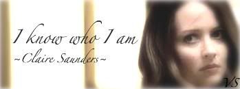
Thanks!  EDIT - Added a Warren banner.  EDIT EDIT - Added Claire Saunders banner.  |
|
Just Willow
Wise-cracking Sidekick
Look to the Western Sky
[Mo0:22]
Posts: 2,575
|
Post by Just Willow on May 28, 2009 23:43:52 GMT -5
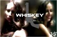
i love the Whiskey av and the Warren banner!
|
|
|
|
Post by VampSlayer on May 28, 2009 23:45:13 GMT -5
Thanks! |
|
lucifurl
Initiative Soldier
Once More With Feeling
Little D
Feelings have been hurt by less[Mo0:2]
Posts: 382
|
Post by lucifurl on May 29, 2009 8:27:42 GMT -5
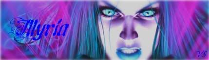
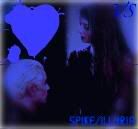
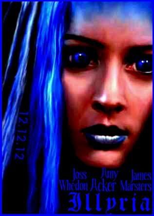
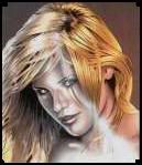
Love the Illyria banner! |
|
|
|
Post by VampSlayer on May 29, 2009 16:41:26 GMT -5
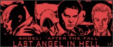
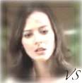
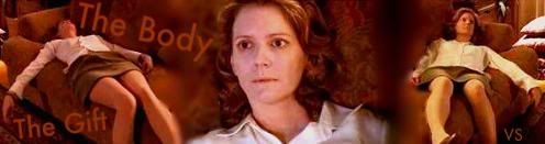
Thanks!  EDIT - I added a 'Last Angel in Hell' banner. I did it real quick, so it may not look too good.  EDIT - EDIT - Added Spike/Illyria avatar. EDIT -[/size] Added Claire Saunders Avatar, and Whiskey character study. |
|
|
|
Post by VampSlayer on May 31, 2009 0:07:47 GMT -5
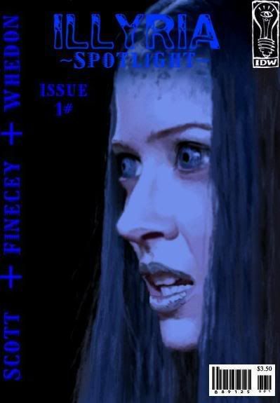
Updated for my Illyria: Spotlight cover I made. |
|
|
|
Post by VampSlayer on Jun 4, 2009 20:46:28 GMT -5
Updated for my newest sets. |
|
|
|
Post by SlayerLV on Jun 4, 2009 23:46:41 GMT -5
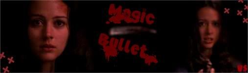
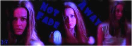
I really love the Illyria banner. The Not Fade away one is great also but I think it could be lightened up just a tiny bit.
|
|
|
|
Post by VampSlayer on Jun 5, 2009 22:20:50 GMT -5
Thank you for the comment, SlayerLV! I agree that some of the banners and other graphics are a bit dark. For some reason when I save my stuff, they get fuzzy looking, and darker. |
|
xaphania
Wise-cracking Techno Genius
[Mo0:0]
Posts: 705
|
Post by xaphania on Jun 6, 2009 5:27:59 GMT -5
Great graphics I think my favourite is the purple Illyria banner - good job on that one Don't know if this will help the darkness problem, but it might help the fuzziness - always save the file as a .png - it's a slightly larger file size but comes out better quality than a .jpg or .gif |
|
|
|
Post by VampSlayer on Jun 6, 2009 10:17:21 GMT -5
Thanks for the tip!  |
|
|
|
Post by Rebecca on Jun 6, 2009 15:12:35 GMT -5
VampSlayer, I really love your banners! They're a little dark, but the placement and 'tone' of the banners are really spectacular. I don't know what program you're using, but when I used GIMP for a short period, I noticed that it tried to save my images at less than stellar quality by default (like 8 out of 10). I also notice that my banners look darker on the site than in my program, it could be the background in my program vs. this background (dark gray vs. almost bleach white) or it could be the image saving or hosting process that darkens it up a bit. I typically end up going back to lighten them after testing on the site |
|
|
|
Post by VampSlayer on Jun 7, 2009 12:46:26 GMT -5
Yes, I think I am going to go back, and lighten up a few of them. Thanks for the comment! |
|
|
|
Post by VampSlayer on Jul 13, 2009 2:02:00 GMT -5
Updated with Illyria Poster.
|
|
|
|
Post by VampSlayer on Jul 17, 2009 19:34:20 GMT -5
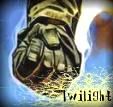
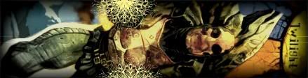
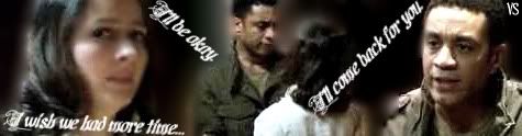
Updated with Twilight Set! Com'on peoples, I need a comment here! lol
|
|
|
|
Post by VampSlayer on Jul 18, 2009 10:44:42 GMT -5
I'd say, but I am way too ashamed of it. lol. Trust me, it's better that I don't say!  But thanks for the nice comment! |
|
|
|
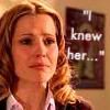
Post by Skytteflickan88 on Jul 18, 2009 10:54:57 GMT -5
I really like the new Twilight set. And the Illyria poster looks cool. But why do you make the text blurry? It's hard to read.
|
|
|
|
Post by VampSlayer on Jul 18, 2009 13:56:59 GMT -5
RE: Sky
Once again, thats a problem when I save them. I always forget to use the tips people tell me. I really like my poster, except for the hard to read text, like you said.
|
|