Eliminated: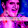
By Skyteflickan88
By VampSlayer
Thank you for entering!
Voters ChoiceYou will have immunity for the next round. However, you must still submit an icon for round three!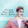
By Erica
Scores Breakdown1: (-3) + (+16) = 13
2: (-18) + (+2) = -16
3: (-9) + (+22) = 13
4: (-3) + (+2) = -1
5: (-11) + (+6) = -5
6: (-) + (+23) = 23
7: (-13) + (+5) = -8
8: (-4) + (+11) = 7
9: (-19) + (+1) = -18
10: (-25) + (+) = -25
11: (-7) + (+16) = 9
12: (-5) + (+) = -5
13: (-16) + (+10) = -6
14: (-2) + (+15) = 13
15: (-3) + (+6) = 3
16: (-) + (+3) = 3
Who Made What & CommentsComments are under the spoiler tag.
Have a look at what people said about your icon (and other peoples), hopefully it will help as the contest continues.
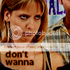
Icon 1
By Midnight Butterfly
(+)Simple but effective, nicely placed text.
(+)I loved this scene with Giles.
(+)Colors are pretty.
(-)The coloring is too dim.
(+)Honestly I just love this shot of Giles. Again the colorizing is very well done.
(+)The image of Giles in grey tones is wonderful, it would have rated higher for me if there was no text. The OMG detracts from the icon. The image set off-centred is perfect, the "feel" to the image is set in the greyscale colouring.
(+)Great quote used, and a lovely colour.
(+) Love the colouring, great font choice and brings in a 3rd reference of the scoobies reaction as well as Buffy viewers, so it has a bit extra meaning I think. Also good crop
(+)looove this moment, and the OMG is a great way of capturing the scoobies reaction.
(+)Honestly this one made me laugh. Great use of text and color balancing.
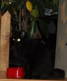
Icon 2
By dragonweaver
(-) Like the idea, but just doesn't really work with that specific picture. Quality isn't great.
(-)A bit blurry quality on the pic down to the right. Maybe some text?
(-)The box effect doesn't work well enough for such a small space. The pictures need to be sharpened as well. Too blurry!
(-)it's a cool idea, but it's really hard to see when it's all chopped up like that
(-)crop lessens image quality.
(-)I love the concept with the multiple crops, but it's a bit too simplistic.
(-) I don't like the cropping.
(-)The zoomed in shot that has just Angels mouth is kind of awkward.
(+)My first reaction was to disregard this one as three images on such a small picture seemed to be too many, but the more I looked at it the more I liked it. I think the two smaller images were well-selected and add to the impact of the icon.
(-)The cut-off hands don't work for me; it's hard to recognise what they are.
Icon 3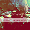
By CowboyGuy
(+) Nice colouring and an interesting crop.
(+)Love the colouring
(+)Effect and subtle text work amazing well with this screencap.
(+)i like the lighting
(-)Bad colourisation quality.
(-)the picture isn't really clear.
(+)Good text and colors.
(+)Great font, great coloring, nicely cropped.
(+)like the coloring.
(-)Nothing spectacular here, and I don't like the colouring.
(+)The grungy look created by the combination of colouring, lighting, and lettering fits very well with the topic of the icon.
(+)The picture is too blurred and I can't even see Spike's face.
(+)really interesting coloring and text, took me a while to notice the text was there, but it's great.
(+)The color effect and faded text just really works.
Icon 4
By Just Willow
(-)I don’t know, one moment I think the text fits, the next moment I don’t.
(+)Like the large font
(-)Lorne seems a little faded, and the font coulda been different.
(+)Great crop job and I love the use of text, it doesn't overpower the image, but still stands out.
(-)It's just very simple and doesn't stand out among the other entries.
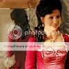
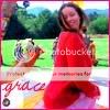
Icon 5
By Iceeh
(-)too simple
(+)Lovely bright clear picture and nice colours.
(-)I'm not a fan of the coloring.
(+)The coloring is very nice.
(-)A little plain and I would have liked the image to be zoomed in more on Lorne's face.
(-)I don't like the pink tone - it is almost a psychedelic look which is not Lorne.
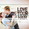
Icon 6By Erica
(+)Absolutely love this, the simplicity of the icon, the great colours and the caption is perfect - and funny, too.
(+)The text is just so true. Love what you did with the background.
(+)Like the text and background
(+)blend works.
(+)Love the colors.
(+)Love the color pallette used and the text.
(+)Really nice idea for crop and background. Nice colouring too, and font works well.
(+)The blue background is great, but the font could use a little change.
(+)simple, elegant, and the text is just perfect.
(+)Really beautiful icon. Perfect text, nice blending, and interesting crop choice. Love it.
Icon 7
By deathisyourgift
(-) The sideways font is really hard to read and the effect at the top makes Spike look weird.
(-)The coloring on Spike's face takes away from the overall image..
(+)perfect scene and perfect text.
(-)Spike's face looks a little too red... Maybe a blending issue? Good choice of font, but it looks sort of cramped.
(-)kind of bright in corner.
(+)I like the cropping.
(-)The blurring around the top is a little distracting.
(+)Love the fonts and text and great crop.
(-)Spike's head looks distorted / low quality. (Nice lettering though!)
(-)The picture is too blurred and I can't even see Spike's face.
Icon 8
By drusillacakes
(+) Simple color enhancement plus silly quote makes silly scene more silly. Simple and excellent at the same time.
(-) The screencap colours are a bit too saturated, but I like the text.
(+)good quality.
(-)Picture distorted and text doesn't flow right.
(+)the picture is nice and clear and I love the text.
(+)Made me laugh more. Good text.
Icon 9By VampSlayer
(-) I wish more had been done with this; the font is good but isn't the most graceful, and the border... eh. It doesn't do much to spice up the scene or give it more meaning; black-and-white would have worked well here, to give it a picturesque quality (more-so than Summer can do naturally of course).
(-)The others are just better. She's graceful, so the text it true, but I don't like the frame.
(-)I didn't like the red border or font.
(-)Colours too bright.
(-)It's too plain for my taste.
(+)Totally beautiful.
(-)Bad Quality.
(-)A little bland and I don't like the cropping job
(-)The picture was not focused, and it just seemed hard to see the "grace" font.
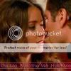
Icon 10By Skytteflickan88
(-) I like the cropping, but not much has been done to improve the colour/quality of the screencap.
(-) The dark colors and purple don't work for the picture or Lorne.
(-)The pink coloring went a bit too far.
(-)too pink
(-)Dislike choice of editing.
(-)Colors are weird.
(-)The way its cropped is a little weird.
(-)really purple.
(-)I don't like the pink tone - it is almost a psychedelic look which is not Lorne.
(-)Interesting crop, but the colouring is too dark and harsh for Lorne's gentle and bright nature. He is also too out of focus for my liking.
(-)Lorne's face is too pink; among other things it makes his tongue blend with his chin.
(-)way too over-saturated coloring, and I love saturated colors...
(-)The color balance and hue is just not appealing. Mix that with the way the icon was cropped and it becomes hard to tell the character is actually Lorne.
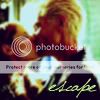
Icon 11
By faiththeslayer
(+)The effects really make the picture stand out.
(+)Romantic and sweet. Great effects. Just wish I could read the text.
(-)The texture makes the image look like poor quality.
(+)Amazing effect and the text, although hard to read, really adds to the piece.
(+)love the texture effect
(-)Too blurry.
(+)Awesome texture, and generally well put together.
(-)kind of plain.
(-)It's too textured.
(-)The image is too faded looking and I cannot tell is the blurry stuff on the bottom is text or not and if it is text, it isn't readable.
(+)Love the romantic, nostalgic atmosphere.
(+)The coloring is great, and the effect of the words on the bottom is great.
Icon 12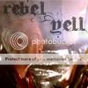
By Greer
(-) Aside from the great font, this one doesn't have a whole lot going for it. Would have liked to see more done from this extreme close-up.
(-)Seems a bit too washed out.
(-)texture over Spike's face makes it look bland.
Icon 13
By Secret Scoobie
(+) First glance, I wasn't a huge fan of this one, but I really love the blurring to give the effect of motion, and the quote is fitting for River. I'd be curious to see the banner counterpart personally.
(-) It looks quite washed out, and I'm not keen on the blurring.
(+)I love the effect, font/colors and quote. Just works perfectly for River.
(-)Didn't like smudge effect
(+)Nice use of blending and interesting text.
(-)Too blurry and sort of simple.
(+)I like the text this person used, nice use of blur and good focus.
(+)Text fits the icon well and it's a great zoom of the image.
(-)I felt like the blur button was used just a bit too much, and the font selection could've been better.
(-)sloppy use of blend tool, text is boring.
(-)I love the text but the blur effect over powers the image.
Icon 14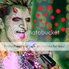
By TabulaRasa
(+) Turning up the green and adding the red dots really sings "Lorne!!!!!" and that's good, it's an excellent Lorne avatar. Those red dots also carry more meaning about Lorne/Andy than I think can be done with any amount of words.
(+) You've done a fantastic job of balancing the colours from the original screencap, and the dotted brush is a great finishing touch.
(+)Great color and nice touch with the red dots.
(+)The red dots really help this icon stand out from the other Lorne avatars.
(+)it just makes me smile.
(+)good edit.
(+)I like the cropping & coloring.
(-)The red dots on this icon are strange. Gives an entirely too reptilian feel to the icon.
(+)I like the image of Lorne and the red spots. I don't know why, but the spots just seem right somehow.
(-)Good cropping and colouring, just not a fan of the red spots, they don't quite blend into it as well as they could have. Kind of intrusive.
Icon 15
By Wyndam
(-) Mixing the two people clutters this one, and the font doesn't quite carry the original meaning of the scene - it's colorful and shiny and David delivers the line sort of deadpan. David's such a big boy, too, that simplicity is the way to go with screencaps of him.
(+)Great quote, font, and color.
(-)Don't much like the text.
(+)Artsy yet simple.
(+)Good crop, nice color-- meshes well with the font.
(+)the girl face looking at Angel. Good having in the icon for humour.
(-)Just because there is less to it than the others. Nothing particularly wrong with it but the crop is basic, and with the colouring. It's good just not spectacular.
(+)Great combination of text and picture, very funny.
Icon 16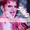
By B E N
(+)Great text used, and a nice crop job. I would love to use this one!
To keep this thread tidy, please use this thread for commenting:
forum.slayalive.com/index.cgi?board=contests&action=display&thread=9131 

 If you have any questions about it, you can PM me.