Paul
Ensouled Vampire
 [Mo0:34]
Posts: 1,173
|
Post by Paul on Sept 9, 2009 13:10:00 GMT -5
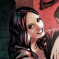
In defense of critiquing art, one of the most basic lessons is how to draw the human form. And Jo Chen is cooed at for her realistic likenesses. When her covers so blatantly ignore the human form that it borders on inhuman (and not talking Vasuki here) then hell yeah, I'm going to criticize. It's still beautiful work...the other areas that aren't so majestically flawed. Like Rebecca wanting to use it as a sig, I would want that too if not for the linebacker neck. As it is, I can't look at the cover without zeroing in on it and it ruins it for me. Meh. What's shocking to me is that fan artists who lack Chen's talent don't make this sort of mistake with the dimensions of the human body. I don't think Willow's neck is that bad. Yeah, sure if I look closely at it, it's a bit too thick, but I wouldn't have noticed that if you hadn't pointed it out. Her waist is the biggest flaw IMO. It's too thin and stretched out. Looking at it, I wonder if maybe Chen drew Willow's head and legs first, and then struggled to make them join up. There are some legitimate problems with this particular cover, but people are very nitpicky with Chen's work in general. |
|
|
|
Post by wenxina on Sept 9, 2009 13:14:05 GMT -5
This one-shot is part of Dark Horse's "One Shot Wonders" compaign thingy, and it was announced at SDCC that they would be $3.50, so I doubt it's permanent or just because of Whedon's name. That'd be ridiculous. Thanks for clarifying. I wasn't suggesting that the price bump was because of Joss' name. The whoring of Joss' name was a separate musing entirely. |
|
|
|
Post by Emmie on Sept 9, 2009 13:14:10 GMT -5
Paul, people really aren't nitpicky about Chen. You can say I'm nitpicky about Chen. Maybe Xi is. But you'll note that the majority of fans view Chen as doing no wrong. I've gotta say, a part of why I do criticize Chen's work in the fandom is because of this attitude. Some people who worship Chen's art, then go on to degradate Jeanty's work. When that happens, well it makes me want to point out that while Chen's work can be very beautiful, no it's not perfect.
Both Chen and Jeanty have very different strengths and styles, but for Chen her biggest selling point is her realistic depictions of the characters. When she loses that realism in a cover, it's a BIG problem. It's similar to panels where Jeanty doesn't bother trying to give the characters' faces detail because they're far away. This was most notable in Issue #23 Predators and Prey.
And why is intelligent and balanced discussion of art immediately viewed as unwelcome? Why can't there be a balance of "well, this isn't great because" alongside all the "oh em GEE it's gorgeous!"
|
|
|
|
Post by AndrewCrossett on Sept 9, 2009 13:28:58 GMT -5
I guess I understand, on an intellectual level, why people criticize some of Chen's work. But I just don't care about the things people base their negative reviews on. I look at it and all I see is a beautiful picture. That may mean I'm just less sophisticated than some in my art appreciation, but I can't help but consistently love her stuff. (With this cover at the top of the list.)
The dissenting opinions on her art don't bother me... I just usually have a diametrically opposing view.
I love Jeanty and Moline's art as well, even though it's very different from Jo's style, and I understand the criticisms people have about both of their art as well.
|
|
Paul
Ensouled Vampire
[Mo0:34]
Posts: 1,173
|
Post by Paul on Sept 9, 2009 13:51:00 GMT -5
Paul, people really aren't nitpicky about Chen. You can say I'm nitpicky about Chen. Maybe Xi is. But you'll note that the majority of fans view Chen as doing no wrong. I've gotta say, a part of why I do criticize Chen's work in the fandom is because of this attitude. Some people who worship Chen's art, then go on to degradate Jeanty's work. When that happens, well it makes me want to point out that while Chen's work can be very beautiful, no it's not perfect. Both Chen and Jeanty have very different strengths and styles, but for Chen her biggest selling point is her realistic depictions of the characters. When she loses that realism in a cover, it's a BIG problem. It's similar to panels where Jeanty doesn't bother trying to give the characters' faces detail because they're far away. This was most notable in Issue #23 Predators and Prey. And why is intelligent and balanced discussion of art immediately viewed as unwelcome? Why can't there be a balance of "well, this isn't great because" alongside all the "oh em GEE it's gorgeous!" Actually, people are VERY nitpicky about Chen's work. These are some of the following criticisms I've heard, both on the internet and in real-life: Buffy looks gangly and out-of-proportion in #1 Xander is overly prettified in #2 Willow is too skinny in #3 Faith has oversized, lopsided boobs in #24 Willow/Andrew's likenesses in #26 Dawn's likeness in #27 Willow's nose is too big in #28 Scythe is at odd perspective on "TLWH" TPB Willow has one eye bigger than the other/Buffy has freakish man arms on "ToYL" TPB Poor likenesses across the board on "Retreat" TPB Most of these are actually true to an extent, but they're also superficial, and don't change the fact that these are gorgeous images. As you say Emmie, no artist is perfect, but people seem to hold Chen to an impossible standard, and rip her work apart over insignificant details. You don't see the Angel covers, none of which hold a candle to Chen's work IMO, being scrutinized so much. It's not that "intelligent and balanced discussion" is unwelcome, it's that people seem to look right past the beauty and straight to the flaws, which is frustrating. Chen's appeal isn't just her good likenesses, but her rich colouring and ability to convey emotion. I first saw her work on Runaways, where likenesses were a non-issue and her work looked more manga-influenced than photorealistic. I kind of wish she'd relax a little and give the Buffy covers more of a cartoonish flair; her work in "Always Darkest" was hilarious because it felt looser and more natural. Oh, and I know you didn't direct this point at me specifically, but I've never degradated Jeanty's art. Jeanty, Urru, and Moline are my favourite Buffyverse artists because they favour naturalism over likenesses. |
|
|
|
Post by Emmie on Sept 9, 2009 14:28:07 GMT -5
I very much agree with you that she should relax and go with her style for "Always Darkest" because when she goes so strictly towards the photorealistic, her mistakes become so glaring. They stick out like sore thumbs. That's the problem. When you go for photorealism, your mistakes become more obvious.
By the way, all the criticisms you listed - many of them were me, lol. Unless you also are hearing this on boards outside of where I post. Heh. Because the critique on Faith's boob in 24 - me (kinda like me being the loudest detractor regarding Safe's writing by Krueger). Although I will say that I never had trouble with Dawn's likeness in #27 - I knew it was her immediately. I actually like that cover - have nothing really bad to say about it. The likeness isn't perfect, but then I don't need it to be perfect to recognize the character. She captured the feel of Dawn so I knew it was her.
|
|
|
|
Post by AndrewCrossett on Sept 9, 2009 14:33:39 GMT -5
I don't think Jo ever really goes for photorealism, FWIW. I think she has a style that just looks deceptively like it's supposed to be photorealism.
I consider her a pre-Raphaelite.
|
|
richie
Potential Slayer
[Mo0:1]
Posts: 170
|
Post by richie on Sept 9, 2009 15:37:20 GMT -5
" I'm anticipating this issue almost as much as the legendary #30."
Andrewcrosset you said everything right now
|
|
Paul
Ensouled Vampire
[Mo0:34]
Posts: 1,173
|
Post by Paul on Sept 9, 2009 16:10:23 GMT -5
I very much agree with you that she should relax and go with her style for "Always Darkest" because when she goes so strictly towards the photorealistic, her mistakes become so glaring. They stick out like sore thumbs. That's the problem. When you go for photorealism, your mistakes become more obvious. Yeah, I'd also like her to experiment a little more with layouts. Some of her covers just look like publicity photos; they're beautiful but not very interesting conceptually. Say what you like about the Willow/Saga cover, but it's not a boring image. I don't think Jo ever really goes for photorealism, FWIW. I think she has a style that just looks deceptively like it's supposed to be photorealism. I consider her a pre-Raphaelite. I know what you mean. One of my favourite artists, Clayton Crain, has an inking style which makes his work look very three-dimensional and "real". But you couldn't really describe his work as "photorealistic", because it's too cartoony. I think Chen's become more photorealistic during her time on Buffy (compare Xander's face on #2 to his face on #27), but her work her on Runaways was never photorealistic. It just seemed that way because of the way it was painted. |
|
|
|
Post by wenxina on Sept 9, 2009 16:55:22 GMT -5
Chen's art has definitely become a lot more "photorealistic" over her tenure over on S8. Her first two covers carry very specific manga influences. Her #1 cover is immediately identifiable as Buffy, but on closer scrutiny, it's definitely very manga-ish in terms of how the face is drawn. The "pretty" Xander is also identifiable right away, but again, very manga-ish.
Then after that... her painted covers became more photorealistic. But other than her cover for #5, I've generally found Chen's covers to be pretty, but also pretty boring. Her process is painstaking, her technique often ridiculously belabored, and it shows... some of her likenesses are stunning. But conceptually... meh.
The cover in question is just kinda weird... Willow's body just looks distorted, and I'm not talking about the breasts here. I for one don't really care to start really jumping down Chen's throat about the titties right now, since for the most part, we've merely commented about the inflation in previous covers in jest. Just because they're naked breasts doesn't change the fact that Chen's drawn them big before. It's the composition that bugs me. Someone mentioned the Boticelli reference over at Whedonesque, and I can see it in Willow's pose, but that doesn't account for the monstrously thick neck. Boticelli's Venus was supposed to be the epitome of feminine beauty, hence the long neck, delicate features, wide hips, pert breasts, etc. Willow here is on steroids... not quite the same thing. Other than that, she appears very slim and delicate, and the waist and hips don't bug me because her body is twisted, so of course her waist looks smaller than usual. It's the first photo trick they teach girls: stand at an angle when taking a photo... it'll make you look slimmer. But something about her entire body just looks very uncomfortable, which doesn't jive with the serene expression on her face. Which is my way of disagreeing with the people who claim that Willow looks like she's straining. If that's exertion, Olympic athletes should all have coronaries! I partially blame this "uncomfortable" pose on having to cover up the naughty bits... which is not the first time. Jeanty's Vasuki in #15 looked painfully posed too, in order to cover her exposed breasts. The funny thing is that Willow's hand which is conveniently covering the "business" now looks like it's in the middle of a transaction with said "business".
But the thing that irks me the most is not the work itself, but some of the inane excuses that people have come up with to rationalize the image. Something about how it's a reflection of Willow's internal changes, how she sees herself becoming more monstrous, etc. Seriously? Call something "not good", and the best justification is a psyche examination? A psyche examination on a hazy psyche? One that requires this very issue to make clear... Yeah... okay. Sometimes a cigar is just a cigar... and despite being what some find to be a very sexy and beautiful cover, this is not one of Chen's finer works... My opinion, of course.
And the best part... my main problem is with Vasuki's arm length. *grumble*
|
|
|
|
Post by butters on Sept 9, 2009 17:17:49 GMT -5
Im really looking forward to this but, yeah, i dont like either cover.
|
|
tigerfan
Innocent Bystander
[Mo0:0]
Posts: 19 
|
Post by tigerfan on Sept 9, 2009 17:27:00 GMT -5
This is not directed at anyone here, but just a general observation of several places, but I don't understand why just because some have a different opinion on subjective art that it must mean they aren't a fan of Chen, hate her art work, this piece, or, the most laughable, are afraid of the human anatomy of a woman.
Being critical of a work of art or even a certain subject doesn't equal to hating it. You can find something beautiful or enjoyable and still have an opinion on different aspects. I enjoy Jo Chen's art and think she is a very gifted artist and I think the Buffy fandom is very lucky to have her as an artist. That said, it doesn't mean if I find certain things that I don't enjoy as much or think is a bit off, it must mean I find the whole thing ugly or a failure. If she were not an official artist for the comics and it was just a fan submitted art piece, I'd be in awe of her beautiful work and still have different opinions on certain aspects of it. I would still find Willow's neck and torso to be off and her fingers a little... strange looking, and yet, still think the piece is a beautiful piece.
Its kind of like the clothes of Buffy. Some of the things the characters wore were horrendous. But that doesn't mean I thought the wardrobe people were a complete failure or thought less of those characters for wearing it, it just meant, sometimes, their clothes made me go... Good grief, what were you thinking? Do you have a mirror??
Anyways, like I said, not directed at anyone here, just a little observation and a little getting it off my chest.
|
|
|
|
Post by Emmie on Sept 9, 2009 18:09:20 GMT -5
*karmas tigerfan*
Yes! Just because I'm subjectively critiquing the art doesn't mean that I don't find Chen to be a great artist.
|
|
|
|
Post by CowboyGuy on Sept 9, 2009 18:14:01 GMT -5
I agree. I definitely think the piece is beautiful, just that the proportions of Willow's body bug me. Doesn't mean I hate it...and it doesn't mean we won't see it on the forum's layout someday.  EDIT: I decided to play with it really quickly, look what 2 minutes of Photoshop can do to make small adjustments: Adjusted the neck, Saga's arm thickness, toned down the booty, made her midsection a tad thicker, and toned the boobies down! |
|
Smashed
Junior Vampire Slayer
[Mo0:3]
Posts: 908
|
Post by Smashed on Sept 9, 2009 19:08:30 GMT -5
Well, well. The long awaited cover (for me anyway) comes to light! I like it. I have to agree with Emmie though. Her midsection is definitely off. The image is gorgeous. Although, I have to say, what's with the random hair that covers Vasuki's breasts? They come from nowhere. Other than that, and the booty/boobalicious Willow...damn. This cover is great. |
|
|
|
Post by Rebecca on Sept 10, 2009 0:07:45 GMT -5
The image is gorgeous. Although, I have to say, what's with the random hair that covers Vasuki's breasts? They come from nowhere. That would be armpit hair. JK, I think it was an afterthought. Ya know, PG-13 and all can't have areola! |
|
|
|
Post by Emmie on Sept 10, 2009 0:28:05 GMT -5
Phil, that looks great! Nicely done. *karmas*
|
|
|
|
Post by wenxina on Sept 10, 2009 7:26:33 GMT -5
The image is gorgeous. Although, I have to say, what's with the random hair that covers Vasuki's breasts? They come from nowhere. That would be armpit hair. JK, I think it was an afterthought. Ya know, PG-13 and all can't have areola! The hair is supposed to come from strands that come from above the shoulder, and from the angle we're seeing Vasuki, it makes sense that you can't see the bit of it that's resting on her shoulder. Pretty sure I saw nipple in Across the Universe and that was PG-13.  |
|
|
|
Post by Rebecca on Sept 10, 2009 11:20:01 GMT -5
Pretty sure nipples aren't PG-13, though that might have slipped the censors. I remember from the Janet Jackson incident :beam:
|
|
jellymoff
Ensouled Vampire
Claimer of Funn[Mo0:0]
Posts: 1,174
|
Post by jellymoff on Sept 10, 2009 11:28:52 GMT -5
Pretty sure nipples aren't PG-13, though that might have slipped the censors. I remember from the Janet Jackson incident :beam: It depends on what we mean by "PG-13". A PG-13 movie can show nipple, but the nude scenes must be limited and not in a highly sexual nature. From the MPAA site: A PG-13 motion picture may go beyond the PG rating in theme, violence, nudity, sensuality, language, adult activities or other elements, but does not reach the restricted R category. The theme of the motion picture by itself will not result in a rating greater than PG-13, although depictions of activities related to a mature theme may result in a restricted rating for the motion picture. Any drug use will initially require at least a PG-13 rating. More than brief nudity will require at least a PG-13 rating, but such nudity in a PG-13 rated motion picture generally will not be sexually oriented. |
|