BlueJay
Descendant of a Toaster Oven
 Resident Charmed Fan[Mo0:12]
Posts: 631
|
Post by BlueJay on Sept 5, 2010 2:25:43 GMT -5
|
|
Hallow Thorn
Bad Ass Wicca
Oh and You're Welcome
[Mo0:0]
Posts: 2,306
|
Post by Hallow Thorn on Sept 5, 2010 3:20:10 GMT -5
That's to bad about "Orpheus"... Missed out on a real gem that could have been “The Cautionary Tale of Numero Cinco” because watching it was just not entertaining enough....
|
|
|
|
Post by Skytteflickan88 on Sept 5, 2010 5:48:47 GMT -5
I love that episode! They're not going to do it?
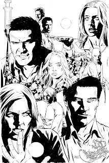
I love that cover. I want that cover!!! Who did the art?
|
|
patxshand
Ensouled Vampire
Writer/director/Amy Acker's husband.[Mo0:0]
Posts: 1,918
|
Post by patxshand on Sept 5, 2010 9:40:56 GMT -5
Read the interview  It's Elena Casagrande. It's just her and Scott's vision of the comic, not an upcoming series or a pitch or anything. Also, just a note: The interview also covers ILLYRIA: HAUNTED and a lot of general stuff. |
|
|
|
Post by Skytteflickan88 on Sept 5, 2010 9:54:29 GMT -5
^^ I would love to read it, but I haven't read past issue 27, and am trying to avoid spoilers. Waiting for the latest HC in the mail.
I would love to buy the original art, "real" cover or not. Do you know if she has a site?
|
|
patxshand
Ensouled Vampire
Writer/director/Amy Acker's husband.[Mo0:0]
Posts: 1,918
|
Post by patxshand on Sept 5, 2010 17:04:05 GMT -5
|
|
BlueJay
Descendant of a Toaster Oven
Resident Charmed Fan[Mo0:12]
Posts: 631
|
Post by BlueJay on Sept 5, 2010 17:35:23 GMT -5
I wish they could do it though. After thinking about, Orpheus has a lot to offer. Pregger-Cordy, Faith, WILLOW, Angel vs Angelus, Team Angel.... aww. Now I REALLY want this.
|
|
The Night Lord
Wise-cracking Sidekick
The Long Kiss Goodnight
There can be no love. Only pain exists[Mo0:1]
Posts: 2,654
|
Post by The Night Lord on Sept 6, 2010 2:25:18 GMT -5
I think I'd rather Orpheus over A Cautionary Tale. That one was kinda boring imo, compared to Orpheus. Though, I'm still hoping for You're Welcome. Very faint hope, but it's still there
|
|
BlueJay
Descendant of a Toaster Oven
Resident Charmed Fan[Mo0:12]
Posts: 631
|
Post by BlueJay on Sept 6, 2010 2:59:00 GMT -5
Well if it came down between You're Welcome and Orpheus, I'd rather have You're Welcome. But out of Orpheus and Numero Cinco, then Orpheus hands down.
|
|
The Night Lord
Wise-cracking Sidekick
The Long Kiss Goodnight
There can be no love. Only pain exists[Mo0:1]
Posts: 2,654
|
Post by The Night Lord on Sept 6, 2010 3:11:31 GMT -5
You're Welcome > Orpheus >>>>> Cautionary Tale
Btw, that's a nice cover. I wouldn't mind seeing it coloured
|
|
|
|
Post by Skytteflickan88 on Sept 6, 2010 7:15:06 GMT -5
THANK YOU!!! Oh, so many cheap wonderful goodies. |
|
BlueJay
Descendant of a Toaster Oven
Resident Charmed Fan[Mo0:12]
Posts: 631
|
Post by BlueJay on Sept 6, 2010 12:50:07 GMT -5
Maybe Scott or Elena can provide a Hi-res version of the artwork and a fan can color it.
|
|
patxshand
Ensouled Vampire
Writer/director/Amy Acker's husband.[Mo0:0]
Posts: 1,918
|
Post by patxshand on Sept 7, 2010 16:28:55 GMT -5
The colorist of my webcomic "ANGEL: LAST NIGHT" (Ryan Marshall) is coloring it right now.
Also, "Hole in the World" was for sure the last adaptation we'll see from IDW.
|
|
|
|
Post by Skytteflickan88 on Sept 8, 2010 6:23:09 GMT -5
|
|
|
|
Post by Skytteflickan88 on Sept 14, 2010 8:38:23 GMT -5
|
|
|
|
Post by wenxina on Sept 14, 2010 9:59:46 GMT -5
*sigh* IMO, this is a piece that's better left uncolored. Reasons:
1. The inks are incomplete. Looking at the hi-res image, there are tons of "white gaps" left where it should be completely black. Casagrande's art also suffers from the same problem in the comics. It just looks unfinished that way.
2. The lines on Faith's face don't look good when you color the image. They are, IMO, unnecessary in the first place, but when you add color over an attempt at creating a three-dimensional space, you end up making Faith look like she has ill-placed and ill-groomed whiskers.
3. The muted color palette washes out EVERYTHING. And the multiple highlight points in Willow's hair is kinda bizarre.
I like to point out that I actually kinda liked the original piece, for what it was. An inked sketch. This, not so much. My fan (and somewhat amateur art appreciator) opinion.
|
|
patxshand
Ensouled Vampire
Writer/director/Amy Acker's husband.[Mo0:0]
Posts: 1,918
|
Post by patxshand on Sept 14, 2010 19:06:59 GMT -5
*sigh* IMO, this is a piece that's better left uncolored. Reasons: 1. The inks are incomplete. Looking at the hi-res image, there are tons of "white gaps" left where it should be completely black. Casagrande's art also suffers from the same problem in the comics. It just looks unfinished that way. 2. The lines on Faith's face don't look good when you color the image. They are, IMO, unnecessary in the first place, but when you add color over an attempt at creating a three-dimensional space, you end up making Faith look like she has ill-placed and ill-groomed whiskers. 3. The muted color palette washes out EVERYTHING. And the multiple highlight points in Willow's hair is kinda bizarre. I like to point out that I actually kinda liked the original piece, for what it was. An inked sketch. This, not so much. My fan (and somewhat amateur art appreciator) opinion. As far as the actual image, it wasn't an inked sketch. Also, I like Ryan's coloring quite a bit. I think a list of reasons why he shouldn't have done it is a bit inappropriate for something that a fan did for fun. |
|
|
|
Post by wenxina on Sept 14, 2010 19:12:47 GMT -5
A. Didn't know he was a fan doing it for fun. B. Any work put out there for judging is fair game for critique. I gave reasons why I liked it better uncolored, not why he shouldn't have colored it. C. Critique is supposed to be useful. The list of what I saw as weaknesses can be used to improve. D. The image looked like an inked sketch to me. There were inks involved (inks that weren't done very carefully, IMO, but inks). But is that really the issue here? E. It's an opinion, not a fact, and you're free to disagree with it, which you did. |
|
patxshand
Ensouled Vampire
Writer/director/Amy Acker's husband.[Mo0:0]
Posts: 1,918
|
Post by patxshand on Sept 14, 2010 19:59:31 GMT -5
Just jumping to my friend's defense. If it hadn't started out with "*sigh*" I might have been a bit less quick to said defense. No harm no foul.
But colored version aside, the B&W version really looks like an inked sketch to you? I know our taste in art differs tremendously (you're a huge Jeanty fan, while I think he went from great to good to awful to okay to decent), but I thought Elena's art here was excellent. Cover-worthy.
|
|
|
|
Post by wenxina on Sept 14, 2010 20:25:46 GMT -5
It looks unfinished to me. It's the same complaint I've had with her work so far... the inks aren't fully colored in. And it could be a sketch, or a proper drawing. Either way, the inks are my problem with the original image.
My comic art appreciation is rather varied, but the usual common denominators are that it suits the story being told, and that there's a sense of personality about it. Jeanty's art fits both criteria for me, so yeah, I like it. I'm also a huge fan of Frank Quitely's art. John Cassaday's art is cool too, and I have developed a liking for Chris Samnee's work. And I love Andy Kuhn's style.
Of IDW's stable, I'm okay with Urru's work. I like his stylized style and non-slavishness to likenesses. What I usually don't like is how his work is constantly at war with the colors... Urru's work almost always looks better in B&W than color, to me. Casagrande is light years ahead of the guy they got for "Aftermath", but her art lacks personality to me. And there is no interesting detail to most of it.
The piece in question was quite accomplished. I actually liked the concept. But the execution looked too referenced to me, and Faith's face does look like she has some unfortunate whisker situation going on.
|
|