|
|
Post by Wyndam on Dec 27, 2009 18:07:39 GMT -5
I absolutely love Karl Moline, so he gets my vote. His work never fails to impress me. I am also a big fan of Pia Guerra, and I certainly wouldn't mind seeing her give the series a try (or Moline as main Season 9 artist and Pia handeling one-shots).
If Jeanty returns, that is fine too, but I am a much bigger fan of what Moline has done with the series than Jeanty (the art in TOYL is some of the best comic art I have seen, period).
|
|
|
|
Post by Nixennacht on Dec 27, 2009 18:39:01 GMT -5
I love how dynamic Moline's art is and on Fray I absolutely adored his work.
He's not quite spot on with the likenesses, but the rest makes up for a lot.
|
|
The Girl In Question
Ensouled Vampire
 Lumpy Space Princess
"It eats you starting with your bottom."[Mo0:33]
Lumpy Space Princess
"It eats you starting with your bottom."[Mo0:33]
Posts: 1,674
|
Post by The Girl In Question on Dec 27, 2009 19:18:56 GMT -5
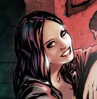
I read about a fan that complained about Gert's being so thin on covers, and Chen answered that she learned to draw in Taiwan (or somewhere) and there were so few overweight people over there, which caused her to getting used to drawing thin women or something like that, and that made her draw Gert thin. It's not a surprise she learned how to draw in Taiwan. I always found that her version of characters looked very anime-ish when she doesn't have real live actors to go off of. It's good when drawing anime, but not when you're going for a more realistic look. I was never a huge fan of hers, and I'm still not. Sometimes she produces absolutely amazing work, but most of the time she falls flat for me. And I don't think there's any excuse for not knowing how to draw obese people, ugly people, etc. She knew Gert was supposed to be larger, so she should have drawn her that way. She didn't grow up around dinosaurs but she seems to draw those just fine. I don't mean to come off as a bitca or attack anyone here. I just think Jo Chen is super overrated. Also, the woman cannot draw an afro for the life of her >.< I decided Paul Lee and Brian Horton would be good for the Buffy covers. They've done great Buffy work in the past, IMO. |
|
Paul
Ensouled Vampire
[Mo0:34]
Posts: 1,173
|
Post by Paul on Dec 27, 2009 19:23:25 GMT -5
I decided Paul Lee and Brian Horton would be good for the Buffy covers. They've done great Buffy work in the past, IMO. While I largely disagree with your Chen-hate, Brian Horton is the shit, it must be said. ;D |
|
|
|
Post by AndrewCrossett on Dec 27, 2009 22:14:00 GMT -5
Some artists I'd love to see draw Buffy comics, at least for a run if not on an ongoing basis:
* Amanda Conner, as said
* Agree with Pia Guerra
* Terry Moore
* Jeff Smith
* Nicola Scott
* Darick Robertson (who's been doing a lot of work for Dark Horse lately)
Some of these have basically no chance of happening, but I can dream.
|
|
Smashed
Junior Vampire Slayer
[Mo0:3]
Posts: 908
|
Post by Smashed on Dec 27, 2009 22:44:52 GMT -5
Cliff Richards! I loved his work on the original Buffy run and his S8 work! Moreso than Moline's for sure.
|
|
Paul
Ensouled Vampire
[Mo0:34]
Posts: 1,173
|
Post by Paul on Dec 27, 2009 23:09:28 GMT -5
Cliff Richards! I loved his work on the original Buffy run and his S8 work! Moreso than Moline's for sure. I find Richards' work extremely bland. I liked what he did with the story "Numb" in Tales of the Vampires. I think he used pastels or something in that, because the colouring was really soft and beautiful ( www.comicvine.com/angel/29-20094/angel/108-4043/105866-angel/105-395721/?offset=17). However, his S8 work has really unimpressed me. Don't get what people see in him. |
|
Smashed
Junior Vampire Slayer
[Mo0:3]
Posts: 908
|
Post by Smashed on Dec 28, 2009 0:08:59 GMT -5
I love his likenesses of Alyson Hannigan, ASH, Eliza Dushku, and just his style in general. Sorry you disagree. :\
|
|
Hellbound Hyperion
Bad Ass Wicca
$20 per soul, no refunds[/B]
Dude, you just rescued a puppy![Mo0:18]
Posts: 2,268
|
Post by Hellbound Hyperion on Dec 28, 2009 0:30:33 GMT -5
Cliff Richards! I loved his work on the original Buffy run and his S8 work! Moreso than Moline's for sure. I find Richards' work extremely bland. I liked what he did with the story "Numb" in Tales of the Vampires. I think he used pastels or something in that, because the colouring was really soft and beautiful ( www.comicvine.com/angel/29-20094/angel/108-4043/105866-angel/105-395721/?offset=17). However, his S8 work has really unimpressed me. Don't get what people see in him. So the question becomes "did Cliff Richards do his own coloring?" Call me crazy, but don't most comic books have a separate person that does colors exclusively? It would be one thing to say "Cliff Richards is a bland colorist" and quite another to say "Cliff Richards is a bland artist". I like his likenesses. That said, I disagree with Smashed - likeness is alright, but TV this ain't and comic art should be unique. Moline's style is for me, always. (Of course, like many others, I don't want to jettison Jeanty - he hits the emotional high points every time, something that I felt Moline could have done better in Fray.) |
|
Jaz ♀♀
Junior Vampire Slayer
Kisses & Gay Love
'Hey Lezallbefriendsbians!'[Mo0:30]
Posts: 941
|
Post by Jaz ♀♀ on Dec 28, 2009 0:33:27 GMT -5
I think Pia Guerra would be great for Buffy...I love her sketches of Buffy on the 1st page.
And I absolutely love Jo Chen's cover artwork so my vote goes for her in s9.
|
|
Paul
Ensouled Vampire
[Mo0:34]
Posts: 1,173
|
Post by Paul on Dec 28, 2009 1:00:39 GMT -5
So the question becomes "did Cliff Richards do his own coloring?" Call me crazy, but don't most comic books have a separate person that does colors exclusively? It would be one thing to say "Cliff Richards is a bland colorist" and quite another to say "Cliff Richards is a bland artist". I like his likenesses. I think he did his own colouring in "Numb", but has a colourist in other titles. Just a guess. Either way, his basic pencils are pretty bland, IMO. |
|
|
|
Post by Emmie on Dec 28, 2009 1:06:58 GMT -5
As far as Buffy: Season Nine, I think we definitely need to steer clear of Jeanty. He had a good run, but he just seems to be getting lazy with a lot of the art. Karl Moline, though, is amazing. The movement, the crispness, the facial expressions, the character design. He's the ideal Buffy artist for me. Except I'm left wondering if he's able to consistently produce on schedule. Yes, he can deliver an issue. And he seemed to do well for ToYL (in which he had extra time). But were the Fray delays partly art or was that just writing? Just look at how Runge's work fell apart under the grind of a monthly annual. But if he's able to produce that quality under the monthly grind, I'd love to have more Moline. I'm just a bit cautious. Hm, I have to say, I really disliked it that she constantly thinned down Gert from Runaways. With Buffy it's not quite that bad, but yes, I could do without it. Have a look at her own comic books for naked men  I tend to say, she does them very pretty, bit bishonen like. So yes, prettied up, but preferable to the horrible muscle bergs that are such common superhero thing. Sounds like Chen would be perfect for drawing Connor then in the IDW title. Much better than making him ripped as all get-out when he took his shirt off in #28. I read about a fan that complained about Gert's being so thin on covers, and Chen answered that she learned to draw in Taiwan (or somewhere) and there were so few overweight people over there, which caused her to getting used to drawing thin women or something like that, and that made her draw Gert thin. That's just... not a good reason. She can't draw people who are fat? Seriously? She's able to draw a Thricewise with three eyes and multiple tongues but she can't draw someone who's overweight? Wow. And frankly, I call BS. Because an artist's style shouldn't detract from the reality of the character. If she's changing characters and making them thin because of her Taiwan-ese style, then she needs to learn how to break free from her style a bit. Realistic depictions? If she can't draw a character that's unattractive and overweight, there's nothing realistic about that to me. No bueno. |
|
Iceeh★
Bad Ass Wicca
Also, Angels.
Somewhere, along in the bitterness.[Mo0:7]
Posts: 2,298
|
Post by Iceeh★ on Dec 28, 2009 4:30:41 GMT -5
Pia Guerra would be amazing. I loved her work on Y The Last Man, wow! She's totally one of my idols.  Karl Moline would also be fantastic, he's got a way of capturing action that I just adore. |
|
patxshand
Ensouled Vampire
Writer/director/Amy Acker's husband.[Mo0:0]
Posts: 1,918
|
Post by patxshand on Dec 28, 2009 4:39:23 GMT -5
Except I'm left wondering if he's able to consistently produce on schedule. Yes, he can deliver an issue. And he seemed to do well for ToYL (in which he had extra time). But were the Fray delays partly art or was that just writing? Just look at how Runge's work fell apart under the grind of a monthly annual. But if he's able to produce that quality under the monthly grind, I'd love to have more Moline. I'm just a bit cautious. Yup yup, totally agree. |
|
|
|
Post by Nixennacht on Dec 28, 2009 6:11:54 GMT -5
Like I said the Gert thing bugged me too, but so far I've seen no one match up to Jo Chen (except Mack maybe), Paul Lee and Brian Horton don't do the trick for me.
The, there are no fat people in Taiwan line is silly of course, but that might be code for "they want a hot thin chick on the cover, sorry the industry is shitty like that".
I think Terry Moore looks like great fun.
Jeff Smith's bone is great, but his style is far too cartoony to fit Buffy, imho.
Nicola Scott's stuff looks great. I could totally see her do Buffy!
Derrick Rogers looks cool too, though a bit generic for my liking.
|
|
|
|
Post by Skytteflickan88 on Dec 28, 2009 9:39:30 GMT -5
I think that Cliff Richards art is perfect to use for a few one shots, maybe a issue or two in the original run like in Season 8. I think he has become a lot better since the original Buffy run to make character's individual. Back then, it was hard to see the difference between the characters. And he gave to dominant jaws to people who didn't have them, which worked fine for issue 24 of Season 8, since Faith has that kind of jaw.
I think his art is beautiful, but it can sometimes look bland, like the characters have no emotions.
|
|
Paul
Ensouled Vampire
[Mo0:34]
Posts: 1,173
|
Post by Paul on Dec 29, 2009 22:37:29 GMT -5
This is kind of an off-topic question/rant, but I wanted to bring it up. Look at the following comic book art and let me know what you think? Do you like it? Would you want this artist to do the art for Season Eight?    I have a theory that a lot of people - especially those who don't read comics a lot - will lap up any comic book art so long as it looks photorealistic, regardless of whether it suits the medium or is even any good. Look at Nick Runge; his work on Angel was godawful but some people liked it because the likenesses were dead-on. On the other hand, artists who are more cartoony, like Karl Moline or even Georges Jeanty, attract a lot of criticism for poor likenesses. There's this perception that the more photorealistic something is, the better it is. The above art was by Greg Land, one of the most hated and controversial artists amongst hardcore comic fans... and for good reason. When I first started reading comics, I loved his work... so do a lot of casual readers. However, the guys a complete hack. He traces photos of models and celebrities and then stitches it all together to create a comic. He's even been accused of tracing pornography (makes you look at that Storm cover in a new light). He also steals from other artists and incorporates it into his own work. His work is horrible... all frozen smiles and pornographic poses. Completely stiff and lifeless, it feels very artifical. But casual/new readers (including myself) never suspect a thing because... well, photorealism = good, right?   As I've become more of a comic fan, I've learned to appreciate more cartoony/stylized artists. Skottie Young (above) is probably my favourite artist at the moment, because his work is so energetic and creative and funny. His characters have personality and life... not just frozen, pretty faces. But a lot of people can't see that because they have a superficial fixation with photorealism. Look at the latest issue of Angel; we had six pages of people staring blankly up at the reader. Sure, the likenesses were good, but there was no movement. Even Jo Chen's covers, which I love, are usually better when they're more anime-inspired. Comics books are all about creating the illusion of a moving story with static images, not about drawing someone exactly like Actor X. What do you think? Do you prefer cartoony or realistic artwork? Is life and movement sacrificed for photorealism? I should probably clarify that I'm not anti-photorealism (hell, my current avatar is an Adi Granov picture of Cyclops). Brian Hitch, for example, is a great artist. Stephen Mooney is also good, when he's at his best (I find him a little inconsistant). I just prefer artists with a little more style and personality to their work. |
|
|
|
Post by wenxina on Dec 29, 2009 23:01:36 GMT -5
Maybe I'm really sick of "sexy", but the porn star poses... a bit much, no? None of those poses are even remotely natural looking, despite the illusion of realism. Maybe Greg Land just loves irony...
|
|
Paul
Ensouled Vampire
[Mo0:34]
Posts: 1,173
|
Post by Paul on Dec 29, 2009 23:25:23 GMT -5
Maybe I'm really sick of "sexy", but the porn star poses... a bit much, no? None of those poses are even remotely natural looking, despite the illusion of realism. Maybe Greg Land just loves irony... I quite enjoy a good porn star pose so long as it's in-character (say Emma Frost or She-Hulk) and well-drawn. But Greg Land just makes me sick. Just Google him and you'll see the extent of his crimes against the comic world. |
|
|
|
Post by wenxina on Dec 29, 2009 23:43:06 GMT -5
I quite enjoy a good porn star pose so long as it's in-character (say Emma Frost or She-Hulk) and well-drawn. Like this one?  I'm mildly upset that they got rid of this completely over-the-top outfit... Frank Quitely had some great designs. The boots, which you can't see in this pic are ridiculous! Platform wedge boots that go up to mid-thigh. Incidentally, I find this image of Emma Frost a lot sexier than the one you posted. Simply because the essence of Emma is present here. I mean, check out that haughty snooty expression, vs the painted grin on Land's art. I mean, this is Emma Frost for crying out loud. No way in hell would she ever be caught smiling like a strumpet, despite her more than slightly revealing choice of attire. |
|