|
|
Post by Emmie on Dec 30, 2009 0:36:58 GMT -5
I fully agree with you, Paul! *karmas* for a great post!
|
|
Paul
Ensouled Vampire
 [Mo0:34]
Posts: 1,173
|
Post by Paul on Dec 30, 2009 2:41:19 GMT -5
 I'm mildly upset that they got rid of this completely over-the-top outfit... Frank Quitely had some great designs. The boots, which you can't see in this pic are ridiculous! Platform wedge boots that go up to mid-thigh. Incidentally, I find this image of Emma Frost a lot sexier than the one you posted. Simply because the essence of Emma is present here. I mean, check out that haughty snooty expression, vs the painted grin on Land's art. I mean, this is Emma Frost for crying out loud. No way in hell would she ever be caught smiling like a strumpet, despite her more than slightly revealing choice of attire. While I loved that costume for it's outrageous sluttiness, I'm not the biggest fan of that image. I always thought Quitely drew her like a teenager, and she has an unfortunate (and notorious) camel toe on that particularly cover. I think John Cassaday (who I'm less fond of) drew a superior Emma. That said, I love Quitely (especially his Cyclops, my favourite X-Man) and he's a good example of people not appreciating good art. A lot of people (including myself, when I first saw his work) complain about him making his characters too "ugly". I've come to find his style fascinating, and a perfect fit for the X-Men, who are supposed to be strange and inhuman. I also loved his costume designs, although nobody drew them as well as him. He made them look really kinky and leathery. As for porny poses that actually work, I'm personally a fan of the below image. Salvador Larroca isn't my favourite artist by any means (he's okay, the colouring makes or breaks him) but I love this pairing and I think the poses are sexy and in-character.  I fully agree with you, Paul! *karmas* for a great post! Wow, thanks! I was worried I'd come across as a snob, but then who am I kidding, I am a snob when it comes to comic book art. ;D |
|
|
|
Post by wenxina on Dec 30, 2009 8:49:39 GMT -5
Ah... see the camel toe is what makes this cover so unique. Let me first agree that at first sight, Quitely does make his characters look "ugly". But I personally find his art beautiful. There's so much detail, nuance, and personality injected into every panel. But back to that image. The camel toe makes the image because it's so realistic, despite it's cartoony-ness. An outfit like that will bunch and grab in all the right and wrong places. The camel toe is deliberate. Emma looks real here because her body "feels" real... the softness of human flesh is evident (her silhouette is not completely smooth... there are bumps), and seriously, that outfit will bunch (it bears repeating). As for drawing her like a teenager, I disagree... his interior art is quite age appropriate; she looks no younger than Jean does... This image just evokes a whole early Britney Spears/Christina Aguilera vibe to me.
But... wow, are we derailed. Well, to bring it back to the topic for a sec, the Quitely image is probably a good enough example of his work (though, one really needs to read the "silent" issue of New X-Men to fully appreciate his talents), and I really don't think Buffy fans will be receptive of his work. As I said before, he's notoriously slow too.
|
|
|
|
Post by AndrewCrossett on Dec 30, 2009 8:59:58 GMT -5
When it comes to drawing beautiful women without resorting to porn poses, my favorite comic artists are Ed Benes, Frank Cho, Adam Hughes, Brian Bolland, Nicola Scott, and Amanda Conner.
(Benes gets criticized for the occasional gratuitous crotch or butt shot, but his women are gorgeous and he draws great action scenes, not pouty pinups. I loved his run on Birds of Prey.)
I wouldn't want complete photo-realistic art in a Buffy comic. When it gets too realistic it starts to look like fumetti (comics made from photos), which I hate.
If we were to select a new Buffy artist, my top choices would be Nicola Scott, Amanda Conner, and Pia Guerra. All women, as it happens... but that's certainly appropriate for Buffy.
|
|
|
|
Post by Nixennacht on Dec 30, 2009 10:57:20 GMT -5
What do you think? Do you prefer cartoony or realistic artwork? Is life and movement sacrificed for photorealism? I should probably clarify that I'm not anti-photorealism (hell, my current avatar is an Adi Granov picture of Cyclops). Brian Hitch, for example, is a great artist. Stephen Mooney is also good, when he's at his best (I find him a little inconsistant). I just prefer artists with a little more style and personality to their work. Hm, I'm kind of devided on the issue. The artist you showed is not my cup of tea at all (though as a kid I kind of liked Michael Turner a lot, and he's also big on the porn star poses, like you say it's probably a progression in taste), but there are some photorealistic artists I do like. My problem with the art of Runge and Mooney is that it feels static and a bit empty. Jo Chen for example does better for me in that department (though I also prefer it when she dives more into manga style). Generally I prefer a good cartoony artist, like say Mark Buckingham or Rebecca Guay, people with a very distinct style over those who draw from fotos. But if someone manages to combine fotorealism (also in bodytypes), with a great expressiveness and dynamic movemments, like David Mack (who often used his girlfriend as a model for Kabuki) that makes for some of my faforite comic book art. I love it when the artists really go into the details and manage to create a flow. As for the superheroins =pornstars thing, it really starts to become incredibly boring, if I want to read porn I can always pick up a Milo Manara comic book and will find better art than in most superhero books anyway. |
|
|
|
Post by wenxina on Dec 30, 2009 11:12:02 GMT -5
A name I'll throw into the mix is Billy Tan. Most of his work is Marvel and Top Cow related, so there's a certain amount of TNA, but if you look at his work posted on his WEBSITE, he can do understated too. His X-23 covers and interiors are quite accomplished, and if you check out his "Paintings and Illustrations" and "Concepts", there are some nice pieces in there too. The fact that he's a fellow Malaysian is just icing.  |
|
Glósóli
Innocent Bystander
[Mo0:0]
Posts: 40
|
Post by Glósóli on Dec 30, 2009 12:38:47 GMT -5
|
|
Paul
Ensouled Vampire
[Mo0:34]
Posts: 1,173
|
Post by Paul on Dec 30, 2009 13:04:40 GMT -5
Ah... see the camel toe is what makes this cover so unique. Let me first agree that at first sight, Quitely does make his characters look "ugly". But I personally find his art beautiful. There's so much detail, nuance, and personality injected into every panel. But back to that image. The camel toe makes the image because it's so realistic, despite it's cartoony-ness. An outfit like that will bunch and grab in all the right and wrong places. The camel toe is deliberate. Emma looks real here because her body "feels" real... the softness of human flesh is evident (her silhouette is not completely smooth... there are bumps), and seriously, that outfit will bunch (it bears repeating). As for drawing her like a teenager, I disagree... his interior art is quite age appropriate; she looks no younger than Jean does... This image just evokes a whole early Britney Spears/Christina Aguilera vibe to me. But... wow, are we derailed. Well, to bring it back to the topic for a sec, the Quitely image is probably a good enough example of his work (though, one really needs to read the "silent" issue of New X-Men to fully appreciate his talents), and I really don't think Buffy fans will be receptive of his work. As I said before, he's notoriously slow too. I'll give you the camel toe as a realistic flaw, but I'm just not a big fan of Quitely's Emma. Not a criticism against his art, just personal taste. I agree though that he captures her personality very well. Grant Morrison wrote the definitive Emma for me, and Quitely did that justice in his art. Quitely is a beautiful artist, I'd love him to do a Buffy one-shot (he could never commit long-term). You're right that most Buffy fans would hate his work, they'd be like "What? That doesn't look like Sarah Michelle Gellar!" When it comes to drawing beautiful women without resorting to porn poses, my favorite comic artists are Ed Benes, Frank Cho, Adam Hughes, Brian Bolland, Nicola Scott, and Amanda Conner. (Benes gets criticized for the occasional gratuitous crotch or butt shot, but his women are gorgeous and he draws great action scenes, not pouty pinups. I loved his run on Birds of Prey.) Isn't Frank Cho infamous for being pretty porny? He's like the definitive T&A artist. I quite like his work, he'd be ideal for a She-Hulk series (not that poor Shulkie could ever bag an A-list artist). I think he'd be an awful choice for Buffy though. I Googled Ed Benes and a lot of gratuitous arse shots popped up (with Psylocke leading the way, naturally... terrible character). A name I'll throw into the mix is Billy Tan. Most of his work is Marvel and Top Cow related, so there's a certain amount of TNA, but if you look at his work posted on his WEBSITE, he can do understated too. His X-23 covers and interiors are quite accomplished, and if you check out his "Paintings and Illustrations" and "Concepts", there are some nice pieces in there too. The fact that he's a fellow Malaysian is just icing. I'm pretty indifferent to Billy Tan. He's done some work in the X-Books, and it always looks like fill-in art. Not bad, just unremarkable. Getting back on topic, I would love for Tim Sale to draw an issue of Buffy. He is, quite simply, the most beautiful artist ever. He's already worked on Tales of the Vampires/Slayers so he's a realistic option for Buffy. Revel in the beauty of Tim Sale-ness....     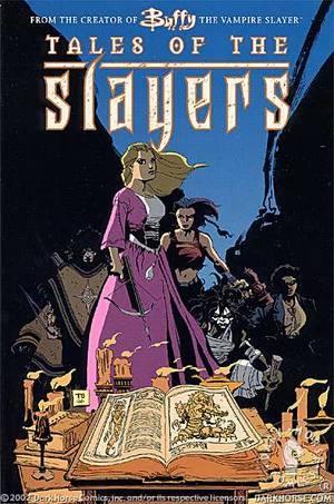  |
|
|
|
Post by wenxina on Dec 30, 2009 13:31:43 GMT -5
Agree on the Billy Tan bit... it's not remarkable, but it's better than quite a bit of the stuff out there. Tim Sale would make a nice one-shot artist. I don't think his style would work for a long-term engagement, especially since it's a lot more stylized which usually doesn't translate very well to facial expressions. I like his work though, and I'm down with him being in some of S9. Just not the whole S9.
|
|
|
|
Post by Wyndam on Dec 30, 2009 13:32:53 GMT -5
I'm kinda all over the map when it comes to my preferences. I consider Franco Urru, Karl Moline, Stephen Mooney and Pia Guerra as my favorite comic artists, and all 4 have completely different styles from each other. Urru and Moline go for more stylized work, where Mooney can nail a likeness almost every time (I don't really care much about likenesses though, as long as I can still tell who the character is), and he also uses heavy blacks and shadows. So I guess I like all types of comic art.  If it looks good (to me), I'm a fan. And Paul that artwork of The Hulk is beautiful! |
|
The Girl In Question
Ensouled Vampire
Lumpy Space Princess
"It eats you starting with your bottom."[Mo0:33]
Posts: 1,674
|
Post by The Girl In Question on Dec 30, 2009 13:56:24 GMT -5
Paul, I personally prefer a cartoony stlye. I like photrealism when it's appropriate, but I'm a huuuuge fan of cartoony styles. They're generally just plain more fun. And don't feel bad for coming off as a snob. I'm a huge art snob. Then again, I'm an art student so if I wasn't I'd be worried, lol.
Again, I don't mean any disrespect to Cho fans. When she does great work, she completely blows me away. But again, most of the time I'm largely unimpressed by her. That's just my opinion. Hoever, I strongly believe she needs to learn how to draw obese people, less attractive people, and people with curly/kinky hair. I mean, gee squids!
Does anyone want to change the color artist for season 9? I personally am in love with Michelle Madsen's coloring (minus some errors she's made). I'm a huge fan of the saturated colors (I'm biased though, because generally I love bright colors), and hope she stays on the team for season 9.
|
|
Paul
Ensouled Vampire
[Mo0:34]
Posts: 1,173
|
Post by Paul on Dec 30, 2009 14:00:15 GMT -5
I'm kinda all over the map when it comes to my preferences. I consider Franco Urru, Karl Moline, Stephen Mooney and Pia Guerra as my favorite comic artists, and all 4 have completely different styles from each other. Urru and Moline go for more stylized work, where Mooney can nail a likeness almost every time (I don't really care much about likenesses though, as long as I can still tell who the character is), and he also uses heavy blacks and shadows. So I guess I like all types of comic art. If it looks good (to me), I'm a fan. I think when Stephen Mooney is on his game, his work is gorgeous. He's good at capturing likenesses without it looking overly photo-referenced (though I'm sure he does photo reference, it isn't obvious). His work does have a slightly stiff, scratchy quality to it, but it works. He also creates this beautiful dark atmosphere, which is perfect for the Angel books. So far, my favourite Mooney work is still Kate's First Night story. I just loved that story and the artwork was superb. I think some of his later work, like Boys and Last Angel, has looked a little more rushed. And Paul that artwork of The Hulk is beautiful! That's from Hulk: Gray, part of the "Marvel Colours" trilogy which includes Daredevil: Yellow and Spider-Man: Blue. I strongly reccomend you pick them up if you have a chance. They're canon, but completely self-contained and accessible, mini-series which focus on the lead characters looking back on their lives and their respective dead lovers (Betty Ross, Karen Page, and Gwen Stacy). The writing and artwork is beautiful, they're ideal for people who like the characters, but are put off by tangled continuity. |
|
|
|
Post by wenxina on Dec 30, 2009 14:12:04 GMT -5
Does anyone want to change the color artist for season 9? I personally am in love with Michelle Madsen's coloring (minus some errors she's made). I'm a huge fan of the saturated colors (I'm biased though, because generally I love bright colors), and hope she stays on the team for season 9. I think it all depends on the art style. Madsen's saturated palette works for S8 because of Jeanty's more cartoony style. That said, there are times when I lean more towards Dave Stewart (the guy who did the first 10 issues of S8). The difference is not that perceptible for the most part, but I think Stewart leans towards a pinkish base tone for skin tones, whereas Madsen leans towards a warmer yellow base. But Madsen's shown that she can color appropriately, based on different styles (to match the different styles of art in S8 and its companion volumes), so I think she's flexible enough to adapt. |
|
|
|
Post by Emmie on Dec 30, 2009 18:18:43 GMT -5
Paul, I just wanted to say thank you for posting pictures with your artist suggestions! Because a lot of the names people are throwing out there are foreign to me. I don't read comics besides the Buffyverse ones. So I appreciate the visuals muchly.
|
|
|
|
Post by Wyndam on Dec 30, 2009 18:36:34 GMT -5
My other favorite comic artist (can't believe I forgot to mention him), Gabriel Rodriguez: Click to View The stuff he does in Locke & Key is just simply amazing. |
|
|
|
Post by AndrewCrossett on Dec 30, 2009 22:15:47 GMT -5
Isn't Frank Cho infamous for being pretty porny? He's like the definitive T&A artist. I quite like his work, he'd be ideal for a She-Hulk series (not that poor Shulkie could ever bag an A-list artist). I think he'd be an awful choice for Buffy though. I agree, I just brought up his name as part of the sidebar conversation about sexy-girl artists. Cho isn't particularly porny. He has had the occasional panel or cover censored for being too revealing, but mostly he's into "good girl" art, as typified by Brandy from his Liberty Meadows comic. He specializes in curvy, athletic types of the She-Hulk, Sheena, and Wonder Woman types. The only Buffyverse girl I think he'd excel at drawing would be Cordy, and she's dead. I Googled Ed Benes and a lot of gratuitous arse shots popped up (with Psylocke leading the way, naturally... terrible character). Well, obviously that stuff is going to be near the top of the Google Image list, but it's a minority. He did a long, gorgeous run on Birds of Prey, which was written by Gail Simone, one of the most feminist comic writers out there. Again, he wouldn't be right for Buffy. I'll stick with Guerra, Scott and Conner as my choices. |
|
Nina
Potential Slayer
[Mo0:0]
Posts: 141
|
Post by Nina on Dec 31, 2009 7:57:47 GMT -5
I'm unfamiliar with the comic world, so I can't come up with real suggestions. I must say that I like some options here and especially Pia Guerra I like.
But I wanted to come back on the discussion about likeness. Maybe it's to blame on the fact that I didn't read much comics (minus Buffyverse, some Fables and in my past Tin Tin.) but I've huge trouble reading when the characters are not looking like their character and human. I certainly don't need to see which photo an artist used to draw a character nor do I really need to see the actor. The first panels with Connor in it which were made by Denham (before the pumped up torso), I couldn't see Vincent Kartheiser but it was Connor and not only because he had long brown hair and a hoodie. I really liked that.
When I read by example BtVS comics, I forget that I read about characters who are older than me. I'm not capable of reading characters who are more cartoon-y. Could be that it's pretty much just me, but I would like to see more human faces. It makes it for me easier to feel the emotions and the character.
|
|
|
|
Post by Nixennacht on Dec 31, 2009 11:52:45 GMT -5
Yes I agree, it's always a b different with characters you already have a picture of, there a complete cartoonisation is often not really enjoyable. Though I think artists like Urru, who has a very distinct style manage ok. Also wanted to add that I really like the new Angel cover artist Jenny Frison, her pictures always seem to have something special about them and they never look generic. I wouldn't mind her doing some guest covers on Buffy. 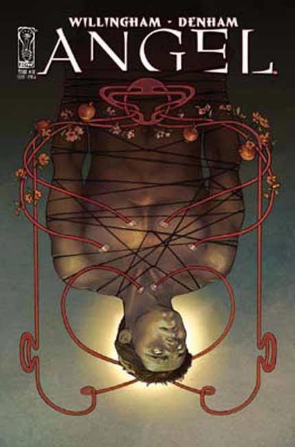 |
|
Billie Erin
Ensouled Vampire
"I go back to December"
"I picked up a hitchhiker. You've got to when you hit them."[Mo0:0]
Posts: 1,536
|
Post by Billie Erin on Dec 31, 2009 11:57:35 GMT -5
I totally agree with you Nina, then again I don't read that many comic books either so maybe it's that that makes us think this way. I must say- particularly on some of the Angel aftermath comics- I had real trouble identifying key characters at first and that makes the comic a little less enjoyable to read, and I didn't like the cartoony depiction of the Buffy characters in season 8 #20
Obviously I'd prefer Jeanty to carry on because his work so far on Buffy has been really great, very true to the characters
|
|
Billie Erin
Ensouled Vampire
"I go back to December"
"I picked up a hitchhiker. You've got to when you hit them."[Mo0:0]
Posts: 1,536
|
Post by Billie Erin on Dec 31, 2009 11:59:53 GMT -5
Nixennacht- I agree again, it's one of the best Angel covers so far. It manages to be both detailed and eye-catching which I find a really powerful combination
|
|